Rebrand
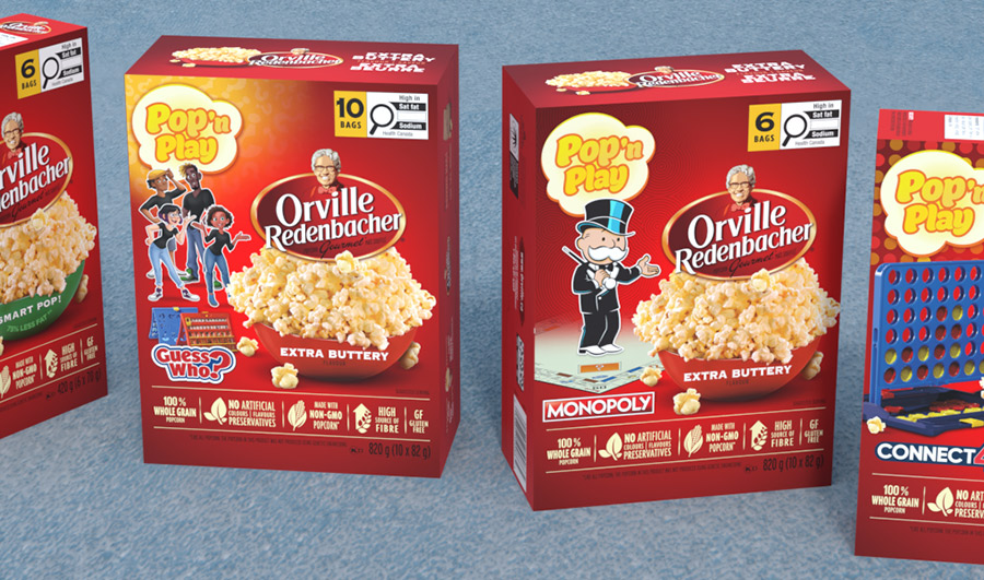
Packaging Design
Beautiful Music + I’m Listening Campaign
Identity + Design + WP Development
IncluCity Festival Ads
Design + WP Development
conference creative
Experiential + Brand Activation
Advocacy OLV spots
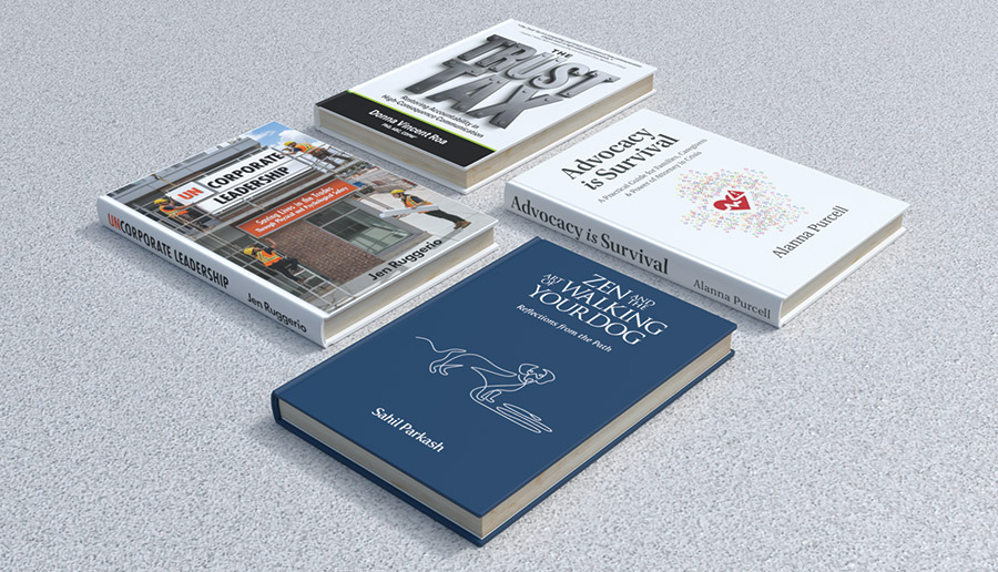
Cover Design
Out-of-Home Campaign
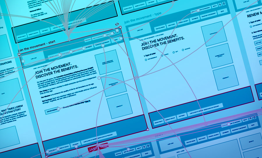
Microsite UX + Visual Design
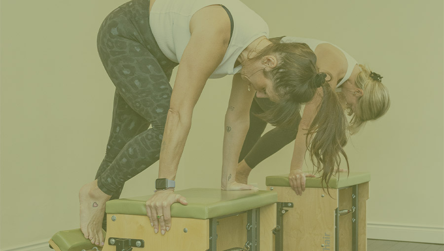
UX Design
All Classical Campaign
Liberty Office Design Elements
Digital ADs
Site Redesign
Print Advertising